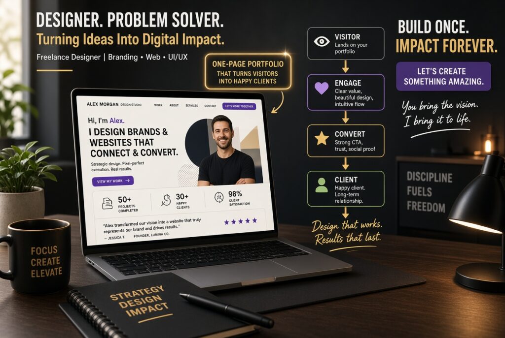
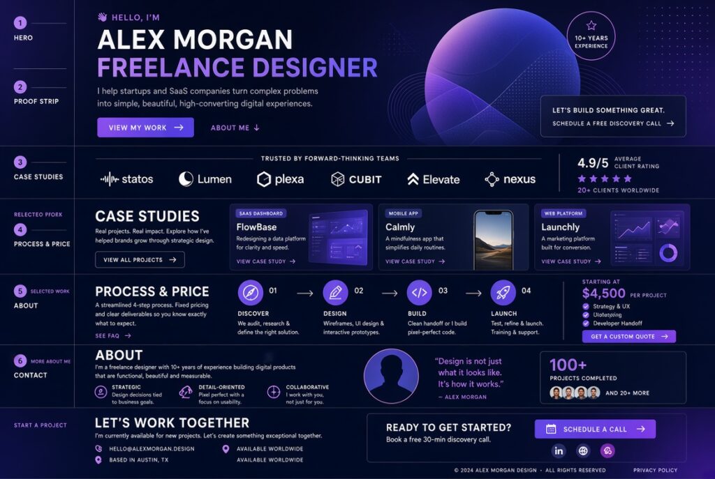
A one-page portfolio converts when it answers four questions in order: is this person for me, can they prove it, roughly what will it cost, and how do I start. Build it as six blocks with about 600 words of visible copy, two or three outcome-led case studies, a visible price signal, and one call to action.
TL;DR
- Visitors scan rather than read. Put your claim, proof, and next step in headings, bold lines, and buttons, because that is the text most people actually take in.
- Use six blocks in a fixed order: hero, proof strip, case studies, process and price, about, contact.
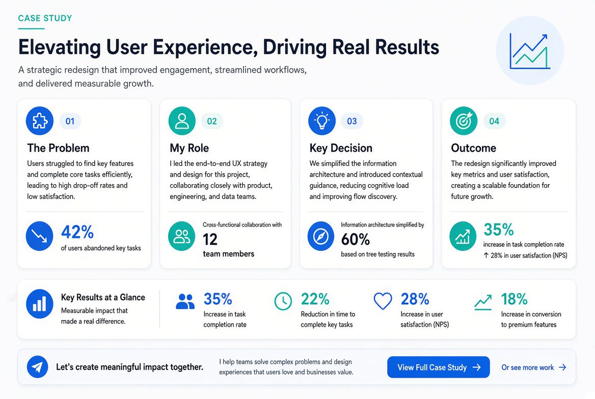
- Each case study needs your role, one decision you made, and an outcome. A screenshot gallery does none of that.
- Most solo freelancers cannot run a statistically valid A/B test on their portfolio (the math is below), so fix the obvious failures instead of chasing small lifts.
- One page is the wrong tool if you sell several unrelated services or need to rank in search for each of them.
Why most portfolio pages lose the visitor before the work is seen
A portfolio page has a harder job than a gallery. A stranger with a business problem lands on it, decides in seconds whether you are relevant, skims for evidence, and then has to trust you enough to send a message. Templates usually solve the first step, which is looking good, and ignore the other three.
The first step does matter. Lindgaard and colleagues showed participants web pages for 50 or 500 milliseconds and found that people form impressions of visual appeal in as little as 50 milliseconds. Tractinsky’s group later replicated the finding, reporting that immediate aesthetic impressions of web pages are remarkably consistent. The limit of that research is that it measured visual appeal. It did not measure whether anyone hired anyone. A page that looks good buys you a few more seconds and nothing else. websiteoptimizationbgu
What happens in those seconds is mostly skimming. Nielsen Norman Group’s “How Little Do Users Read?” concluded that on the average web page, users have time to read at most 28% of the words during an average visit, and 20% is more likely. That is a general-web average from 2008, drawn from a highly educated European sample, and it is not a portfolio benchmark. It is still the best public number for what a cold visitor does with text. nonprofitmarketingguide
The reading budget
Take the 20% figure and apply it to a page of about 600 visible words, which is roughly the size of the layout below. The average visitor takes in around 120 words. That is a calculation from a general-web average and should be treated as a planning figure, not a prediction.
The same study offers a marginal rule. Each extra 100 words of copy buys about 4.4 seconds of visit time, and at a reading speed of around 250 words per minute that is 18 words, so added text is read at a rate of about 18%. In practice, every paragraph you add is read at a rate of about one line in five, and it competes with the lines that matter. cuttingedgepr
Your task is to make sure the ~120 words a visitor absorbs are the right ones. Those are the hero line, the case-study headlines, the outcome sentences, the price signal, and the button. Everything else can be as long as you like, but it should be written for the minority who read it.
The six-block layout
The order follows the questions a buyer asks, and each block has a word budget that reflects how much it can afford to say.
The word budgets are editorial judgments, not measured optima. They sum to roughly 590 words, which keeps the page short enough that its important lines are also the lines most likely to be read. The order is the part I would defend hardest. Price and process sit after proof and before the personal story, because a buyer who is qualified but unsure of the cost tends to leave rather than ask.
Block 1: Hero
Name the person you help, the outcome, and one action. “Brand identity for early-stage B2B software companies” beats “Creative designer & storyteller” because the visitor can tell in two seconds whether they belong. Put a real photo or a clean, on-topic work sample beside it, and skip the carousel and the autoplay video. Both delay the largest element on screen, which becomes a measurable problem in the performance section.
Block 2: Proof strip
Use client names, logos, publications, or a single verifiable metric, and only if they are real and you have permission. If you have none yet, leave this block out instead of filling it with vague claims. An empty proof strip is less damaging than one that reads as invented, and the layout still works without it.
Block 3: Case studies
Include two or three, not six. Every extra project adds text that gets read at about a 20% rate and pulls attention from the strongest work. The trade-off is real: fewer projects means less range on display, so if you serve two clearly different client types, choose one project for each and state the audience in the heading.
Give each project a fixed shape of about 110 words:
- Problem: what the client needed, in one sentence.
- Role: exactly what you did, and what others did.
- Decision: one non-obvious choice and why you made it.
- Outcome: what changed, in numbers if you have them.
The decision line is what separates a case study from a picture with a caption. It shows judgment, which is what a client is buying.
If you don’t have outcome numbers, say what changed qualitatively (“the sales team stopped rebuilding the deck for every pitch”) and say who confirmed it. Do not estimate a figure to fill the gap. If you have no client work yet, build two self-initiated or spec projects and label them as such in the heading. Visitors forgive a labeled spec project far more readily than a client project that turns out to be invented.
Block 4: Process and price signal
Three steps, in plain words, are enough: what happens after they contact you, what you need from them, and what they get and when. Then give a price signal such as “Projects start at $X” or “Typical engagements run $X to $Y”.
I take a clear position here: show a starting price unless your work is genuinely scoped one client at a time, as in enterprise consulting. It filters out mismatched inquiries before they cost you a call. Two costs come with it. A low “starting at” number can anchor clients below what you would quote, and a wide range can look evasive. Both are manageable by pricing a defined package instead of your whole practice. This is reasoning from how buyers behave, not a measured result. I found no public dataset comparing inquiry quality with and without a visible price.
Block 5: About
Keep it short and factual: what you do, who you have done it for, where you are based, and how you prefer to work. A human photo helps because it answers “who am I dealing with?” faster than any sentence. Only include credentials and years of experience that a client could verify.
Block 6: Contact
Offer one action. The common alternative is a form, an email address, and a booking link side by side, which forces a choice at the moment you want momentum. Pick the one that fits how you sell:
- Booking link suits services sold on a call. It commits the visitor to a time, which raises intent but also raises friction.
- Short form (name, email, one line about the project) suits work that needs a written brief first. Each extra field is another reason to abandon the form.
- Plain email address is the lowest-friction option and works best when your inquiries are few and personal.
Whichever you choose, repeat the same action in the hero and at the bottom. State a response time only if you will keep it.
A fill-in copy skeleton
Replace every bracket with your real facts. Delete any block you cannot fill honestly.
HERO[Outcome you deliver] for [specific client type].[One sentence: how, in plain words.][Button: Book a 20-minute call / Send a project brief]PROOF STRIP[Client or publication] · [Client or publication] · [One verifiable result, if you have one]CASE STUDY 1: [Client type / project name]Problem: [One sentence.]My role: [What you did. What you did not do.]Key decision: [The choice, and the reason.]Outcome: [What changed. Number, source, and timeframe if available.]CASE STUDY 2: [same four lines]HOW IT WORKS1. [What happens after you get in touch]2. [What you need from the client]3. [What they receive, and when]Projects start at [price] / Typical range: [price] to [price].ABOUT[Name] is a [role] based in [place], working with [client type]. [One sentence on approach.] [One sentence a client could verify.]CONTACT[Same button as the hero.] [Email as a fallback.]Performance and accessibility
A one-page portfolio is image-heavy by design, and that is where these pages tend to break. Google’s Core Web Vitals targets, measured at the 75th percentile of real visits, are a Largest Contentful Paint of 2.5 seconds or less, an Interaction to Next Paint of 200 milliseconds or less, and a Cumulative Layout Shift of 0.1 or less. As of the sources checked in September 2026, those thresholds have not changed. agilebrandguide
Portfolio pages hit the same three problems repeatedly:
- The hero is the largest element. If it is a full-width photo or video, it decides your LCP. Serve a properly sized image, do not lazy-load it, and avoid autoplay video above the fold.
- Case-study images without dimensions cause layout shift. Set width and height on every image so the page doesn’t jump as it loads.
- A stack of scroll-triggered animations hurts responsiveness on mid-range phones, which is where a quarter of your visits are measured.
For readability, text needs a contrast ratio of at least 4.5:1 against its background under WCAG 2.2’s minimum contrast criterion, and the pale-gray-on-white style common in portfolio templates often fails it. Give every work image a descriptive alt attribute, because it doubles as the caption a screen reader user gets.
When one page is the wrong choice
One page reduces navigation decisions. Whether it converts better than a multi-page site is a question I can’t answer with public evidence. I found no controlled comparison, and the answer would depend on traffic source and service type. Resolving it would take an A/B test on the same traffic, which brings us to the next section.
The format does have clear limits:
- Several unrelated services. A single page can’t be about branding, web development, and copywriting at once without diluting each message. Separate pages let each one carry its own promise.
- Search visibility. One URL competes for one primary topic. If clients find you by searching for a specific service in a specific city, dedicated service pages will usually serve you better than anchor sections on one page.
- Buyers who need depth. Procurement teams and larger clients often want long-form case studies. Keep the one-pager as the front door and link two or three case studies out to their own pages.
- Job seekers. A recruiter wants a résumé and a role fit, so the six-block logic above needs a different Block 2 and Block 4.
How to know whether it works
Track one metric: qualified inquiries per 100 unique visitors. Define “qualified” before you look at the data (budget in range, project type you actually want), or the number will drift toward whatever flatters you.
Then be realistic about testing. Using Lehr’s rule of thumb for two-group comparisons (about 80% power, 5% significance), the required sample is roughly 16 × p̄(1 − p̄) ÷ δ² per variant. Suppose, as an illustrative assumption since no public portfolio benchmark exists, that your baseline is 1% and you want to detect a rise to 1.5%. That is about 7,900 visitors per variant, or roughly 15,800 in total. At 500 visits a month, that is over two and a half years.
So for most solo practitioners the practical approach is different. Make changes for clear reasons (a broken form, an unreadable hero, an unclear offer), record the date, and compare inquiry quality over several months. Treat any short-term movement as a hint, not a result. A dozen conversations with recent visitors or clients about what nearly stopped them will teach you more than a split test at this traffic level.
Pre-launch check
- Can a stranger say who you help and what they get within five seconds of seeing the hero? Show it to someone unfamiliar and ask.
- Does every case study state your role and an outcome?
- Is every claim, logo, and number real and permitted?
- Is there a price signal, or a deliberate reason for not having one?
- Is there exactly one call to action, repeated in the same form?
- Does the hero image load fast on a mid-range phone, with dimensions set on all images?
- Does body text meet 4.5:1 contrast, and does every image have alt text?
- Does the page title carry your service and, if it matters to clients, your location?
Publish, watch inquiries for a full quarter, and revisit the case studies first. They do the most work on the page, and they go stale fastest.