Portfolio Layout Formula
Sarah Chen refreshed her inbox at 9:14 AM on a Tuesday morning in October 2025. Three interview requests sat in her inbox—from Stripe, Figma, and a Series B fintech startup. All arrived within six days of updating her portfolio. “I changed the layout Sunday night,” she told the recruiter during her first call. “I didn’t expect anything for weeks.” The recruiter’s response: “We found your work in 11 seconds.”
That timing isn’t coincidental. Recruiters in 2026 spend an average of 2-5 minutes reviewing portfolios during initial screening, with the critical decision happening in the first 6-8 seconds. Sarah’s portfolio survived that brutal filter because she understood one principle: hiring managers don’t read portfolios—they scan for proof you can solve their specific problem right now.
The portfolio structure that generates callbacks in 2026 doesn’t showcase artistic talent or impress with design flourishes. It answers one question before the recruiter’s attention drifts: “Can this person deliver measurable business impact in the role we’re hiring for today?”
The 11-Second Reality: What Recruiters Actually See
Research shows recruiters spend approximately eleven seconds scanning GitHub profiles and portfolio homepages during initial reviews. Within that window, they’re asking a single question: does this candidate solve problems we’re currently facing?
Most portfolios fail this test immediately. They bury impact metrics five clicks deep, showcase outdated project types from 2019, or force recruiters to decode abstract creative concepts when they need concrete business results. Meanwhile, AI and machine learning job openings surged 54% in August 2025, but portfolios haven’t evolved to match current hiring priorities.
Senior design role applications average 200+ submissions, with hiring managers spending 6-8 seconds on initial portfolio scans before deciding whether to investigate further. The decision to continue reading happens almost instantly, driven by visual hierarchy, the immediate clarity of the value proposition, and evidence of strategic thinking visible above the fold.
The gap between candidate expectations and recruiter behavior creates a predictable failure pattern. Candidates believe recruiters will discover their genius through careful case study analysis. Recruiters operate under time pressure, scanning for instant proof of relevant skills applied to business problems similar to what they’re hiring to solve.
📋 PRACTICAL TIP: Test Your 6-Second Scan
Open your portfolio in a new browser window. Set a timer for 6 seconds. Close your eyes, start the timer, open your eyes, and scan the page. Stop exactly at 6 seconds. Write down everything you absorbed. If you can’t articulate your primary value proposition and strongest outcome metric, neither can recruiters. Redesign until your impact is visible in that initial glance.
Above-The-Fold Architecture: The Make-or-Break Zone
Heatmap studies reveal 80% of user attention focuses on content above the fold, with visitors forming opinions about websites within 0.05 seconds. For portfolios, this means the hero section—everything visible before scrolling—determines whether recruiters engage or move to the next candidate.
The traditional portfolio hero fails in 2026 by leading with designer biography, aesthetic experiments, or vague mission statements. Winning portfolios flip this structure entirely: they open with the most impressive business outcome delivered, supported by the specific metric that proves it happened.
Structure your above-the-fold content as a value proposition statement containing three elements: your role, the specific outcome delivered, and the measurable impact. “Senior Product Designer | Increased conversion 34% through streamlined onboarding | 50,000+ new monthly active users” communicates more in one line than three paragraphs of professional philosophy.
Hiring managers tend to prioritize business metrics over design aesthetics, quickly scanning portfolios for evidence of strategic thinking and measurable outcomes within the first 10 seconds. Your hero section must deliver this proof instantly or lose the reader to the next portfolio in their queue.
Visual hierarchy in the hero section should guide eyes through a Z-pattern: the top left establishes identity and core competency, the top right shows the strongest metric, the bottom left presents supporting credentials or specialization, and the bottom right contains the primary call-to-action. This layout leverages natural reading patterns to communicate maximum information in minimum time.
The background image or video in your hero section should reinforce credibility without competing for attention. High-performing portfolios use subtle, professional visuals that create context without distraction—product screenshots, simplified workflow diagrams, or clean abstract patterns that complement rather than dominate the text elements.
Case Study Structure: Inverted Pyramid Format
Hiring managers spend less than 60 seconds scanning case studies before deciding whether to continue reading, making the opening section critical for engagement. Traditional case studies begin with problem context and walk chronologically through the design process. This structure fails because it delays the information recruiters care about most: what you delivered and whether it worked.
The inverted pyramid structure places outcomes first, followed by key decisions that drove those results, then supporting evidence of process quality. Start each case study with a headline that leads with impact: “Boosted User Activation 34% Through Streamlined 3-Step Onboarding” immediately signals value. Including a 2-3 sentence summary of the business context and your specific contribution provides recruiters with all the information they need to evaluate the relevance of your work.
Senior portfolios should lead every case study with business context rather than design process, extracting the biggest metrics and making them 3x larger than surrounding text. Create a scannable “Project Overview” box at the top of each case study containing your role, the business goal, key outcomes with specific numbers, a timeline, and a tech stack or methodology. This box should be readable in 15 seconds or less.
After establishing outcomes, the middle section addresses methodology: what key decisions or insights led to your success? Rather than documenting every workshop and iteration, focus on 2-3 pivotal moments where your specific expertise drove results. For each decision, explain the rationale, the alternative approaches you considered, and why your choice proved correct based on data or user feedback.
The evidence layer supports your claims without drowning readers in process documentation. Use annotated visuals—wireframes with callouts explaining design rationale, before/after comparisons showing specific improvements, or workflow diagrams illustrating system architecture changes. Each visual should communicate a specific insight in five seconds of scanning.
⚠️ WARNING: Process Overload Kills Engagement
Designers commonly document every research session, iteration, and stakeholder meeting, creating case studies that exceed 5,000 words. Effective case studies contain 800-1,500 well-structured words combined with relevant visuals, prioritizing clarity and depth over unnecessary length. Excessive process detail signals junior-level thinking focused on activities rather than outcomes. Please edit carefully: if a section does not directly support your impact claim, consider removing it.
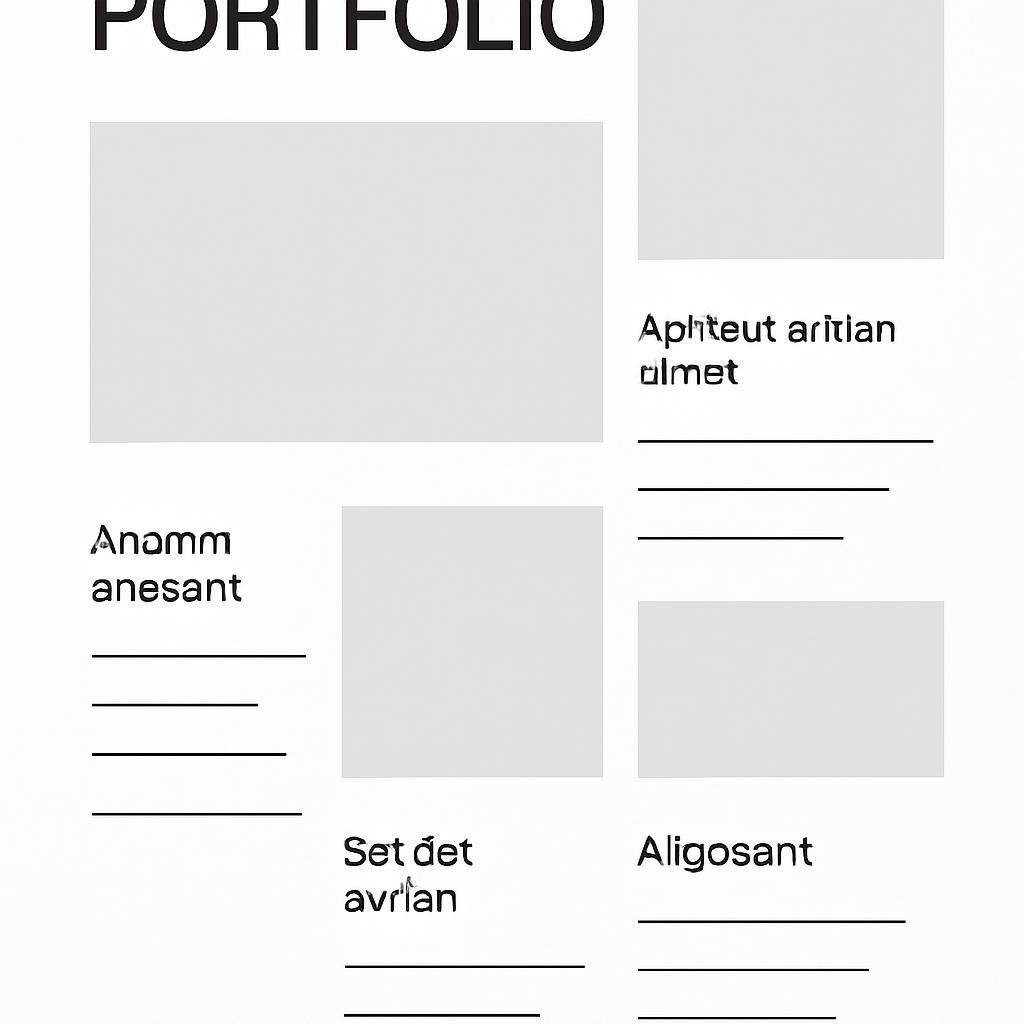
The Project Overview Block: Your 30-Second Sell
Every case study requires a scannable project summary that answers four questions in 30 seconds or less: What business problem existed? What was your specific role? What did you deliver? What measurable outcome resulted?
Format this as a bordered callout box immediately below your case study title, using a structure like
Role: Lead Full-Stack Developer
Challenge: Legacy payment system processing 200 transactions/minute, causing 15-minute checkout delays during peak traffic
Solution: Rebuilt payment infrastructure using Next.js frontend, Node.js backend, MongoDB database, integrated Stripe API with real-time processing
Impact: Reduced checkout time 73% (15 min → 4 min), increased completed transactions 41%, generated $890K additional monthly revenue
Recruiters scan project pages for immediate clarity, requiring a Project Overview box containing your role, the goal, and key outcomes with metrics visible before scrolling. This structure gives busy hiring managers everything they need to assess relevance to their open position before investing time in detailed reading.
The Project Overview block should use consistent formatting across all case studies—same fonts, colors, and layout structure. This consistency allows recruiters to quickly locate and extract information when scanning multiple projects, reducing cognitive load and increasing the likelihood they’ll engage with your full case study.
For technical roles, include your tech stack in the Project Overview: “Built with React, Node.js, PostgreSQL, AWS Lambda” immediately signals whether your experience matches their technical requirements. For design roles, specify deliverables: “Created user flows, high-fidelity prototypes, design system components, and usability testing protocol.”
Business Metrics vs. Vanity Metrics: What Actually Matters
Vague statements like “Improved UX” lack meaning because they don’t specify how improvement was measured, by what amount, or for whom. Recruiters distinguish between metrics that prove business impact and numbers that merely document activity.
Business metrics tie directly to revenue, cost savings, user growth, retention, or conversion improvements. “Increased conversion rate of 18%, generating $340K additional monthly revenue” connects design work to financial outcomes. ” “Reduced customer support tickets by 52%, saving $180K annually in support costs” quantifies operational impact. “Improved user activation from 23% to 34%, adding 50,000 monthly active users” demonstrates growth contribution.
Vanity metrics describe outputs without business context: “Conducted 15 user interviews,” “Created 47 wireframes,” “Ran 8 A/B tests.” These numbers prove you performed activities but don’t demonstrate value delivered. Recruiters skip over portfolios heavy on vanity metrics because they signal a focus on process over outcomes.
When you lack hard numbers—common for speculative projects, early-stage work, or restricted client data—use proxy metrics that indicate success. “80% of test participants completed checkout flow vs. 40% with the previous design” shows relative improvement. “Stakeholder feedback: ‘Significantly reduced onboarding time based on first-month analytics'” provides qualitative validation. The feature was successfully launched to 100,000 users, and positive sentiment analysis establishes its scale and reception.
Structure your metrics for scanning: bold the number, use percentage signs and currency symbols rather than spelling out “percent” and “dollars,” and place metrics at the beginning of sentences rather than burying them mid-paragraph. “Reduced load time 40% (8.2s → 4.9s)” scans faster than “The application’s load time was improved, going from 8.2 seconds down to 4.9 seconds, representing a 40 percent reduction.”
📋 PRACTICAL TIP: The Metric Validation Test
For every metric in your portfolio, answer: “If my implementation had failed, could this number have been worse?” If the answer is no, it’s probably a vanity metric. “Conducted 12 user interviews” can’t fail—you always conduct some number. The statement, “Identified 3 critical pain points affecting 67% of users,” could be misleading, as it suggests that finding zero pain points would still be a valid outcome metric if your research revealed none.
Mobile-First Responsive Design: Where 70% of Views Happen
Analysis shows 70% of portfolio traffic comes from mobile devices, making mobile optimization critical for recruiter engagement. Recruiters review portfolios during commutes, between meetings, and while scanning multiple candidates in succession. If your portfolio doesn’t function flawlessly on mobile, you lose most of your audience.
Mobile-first design for portfolios means designing the mobile experience first, then expanding for larger screens, rather than creating a desktop site and attempting to compress it for phones. Start by defining the absolute minimum information required to evaluate your work: project title, outcome metric, role, brief context, and link to full case study. Build the mobile layout around these essentials.
Test your portfolio on actual devices, not just browser developer tools. Safari on iOS renders differently than Chrome on Android. Load times that seem acceptable on fast office wifi become unbearable on cellular networks. Touch targets that work with a mouse cursor fail when someone tries to tap them with a thumb while standing on a train.
Key mobile portfolio requirements: buttons and links must be 44×44 pixels minimum for reliable touch interaction, text must be readable without zooming (16px minimum for body copy), navigation must be accessible with one-handed thumb operation, images must be optimized for cellular bandwidth with lazy loading below the fold, and no horizontal scrolling should be required for any content.
Portfolio navigation on mobile should be simplified compared to desktop. Complex dropdown menus fail on small screens. Winning mobile portfolios use a fixed bottom navigation bar with 4–5 maximum options: work, about, contact, and potentially skills or processes. Each tap should provide immediate visual feedback to confirm the registered interaction.
Image galleries and project showcases need special attention on mobile. Rather than displaying 6-8 thumbnail images per row as on desktop, mobile layouts should show 1-2 larger images per row, allowing users to actually see detail without squinting. Implement progressive loading so the first image appears quickly while subsequent images load in the background, preventing users from staring at blank screens.
The FAQ Section: Addressing Objections Preemptively
A frequently asked questions section in your portfolio serves two purposes: it answers common recruiter questions before they become reasons to skip your profile, and it demonstrates you understand hiring concerns and address them proactively.
Strategic FAQ selection focuses on questions that influence hiring decisions. “Can I request deletion of work from client portfolios?” matters less than “How do you handle projects under NDA?” or “What’s your approach when business metrics and user needs conflict?”
Strong portfolio FAQs address practical concerns recruiters consider during evaluation:
Q: How do you showcase work completed under strict NDAs?
A: I anonymize sensitive details while preserving impact metrics and design decisions. Client names become “Series B Fintech Startup” or “Fortune 500 Retail Company.” Specific product details transform into generic equivalents: “Payment processing dashboard” rather than proprietary feature names. I always verify with legal teams before sharing portfolio examples and can provide additional details under mutual NDA during interview processes.
Q: What if you don’t have exact metrics for project outcomes?
A: When hard numbers aren’t available, I use validated proxy metrics: usability test improvements (task completion rate increased from 60% to 85%), stakeholder feedback from retrospectives, or relative performance comparisons. I’m explicit about metric limitations: “Estimated impact based on first-month analytics” rather than claiming precision I don’t have.
Q: How do you prove impact on team projects where credit is shared?
A: I specify my exact contribution: “Led design system creation (15 reusable components)” or “Owned checkout flow redesign while collaborating with 2 other designers on broader product strategy.” I distinguish between projects where I led strategy vs. execution vs. contribution. Recruiters value honesty about collaboration over claiming sole credit.
Position your FAQ section after your main portfolio content but before the contact form. Keep answers focused and specific—50-150 words maximum per question. Link to relevant case studies or external resources when deeper explanation would help: “See how I navigated NDA restrictions in the [E-commerce Checkout Project].”
⚠️ WARNING: Generic FAQs Waste Valuable Space
Common but useless FAQ topics: “What is UX design?” (recruiters already know), “Why should you hire a designer?” (they’re already looking), and “What tools do you use?” (they care more about outcomes than tools). Every FAQ should address a specific concern that influences hiring decisions for your target roles. If the answer does not assist recruiters in evaluating your suitability, it would be advisable to omit that question.
The About Section: Business Problem-Solver First
Successful senior portfolios include clear “About” sections positioning designers as business problem-solvers rather than focusing solely on design process expertise. Your About page should establish professional credibility, demonstrate business understanding, and make clear what types of problems you solve best.
Open with your value proposition: one sentence answering, “What business problems do I solve, and for whom?” Strong examples: “I help Series A-C startups scale product design from MVP to multi-million-user platforms” or “I build payment infrastructure for high-transaction e-commerce systems processing $5M+ monthly revenue.”
The body of your About section should contain three elements: your relevant background establishing domain expertise, your approach to problem-solving showing how you think, and specific types of work you pursue clarifying where you add most value. Keep the entire section under 300 words—recruiters won’t read more.
Background should emphasize relevant experience, not chronological career history. “7 years building fintech products for regulated environments” matters more to fintech recruiters than where you went to college. Quantify your experience: “Shipped 12 products from concept to launch, serving 2M+ users” gives concrete scope.
Your approach section should differentiate you from other candidates. Generic statements like “I’m passionate about user-centered design” or “I believe in data-driven decisions” say nothing because every portfolio claims this. Instead, describe your actual working style: “I prototype quickly in code rather than static mockups, allowing teams to user-test interactive experiences within 48 hours of kickoff” or “I embed with engineering teams during implementation to resolve design-technical tradeoffs in real-time.”
The types of work statements help recruiters pre-qualify you: “I focus on complex data visualization and dashboard design for technical audiences” or “I specialize in consumer mobile apps with millions of daily active users.” This specificity may reduce total inquiries but dramatically increases the quality of opportunities by attracting matches while filtering poor fits.
Include a professional photo—portfolios with faces receive more callbacks because humans connect with humans. The photo should be current, well-lit, professionally composed, and show you as you’d appear in a work context. Skip creative poses or overly casual settings unless your target industry expects that aesthetic.
Real-Time Projects: The 2026 Portfolio Standard
Static portfolio sites that display completed work from 6–12 months ago signal you’re not actively building. The disconnect between 2026’s technology landscape and portfolios showcasing projects from 2019 creates immediate credibility problems.
At least one project from the past 90 days should be present in your current portfolios, indicating your active engagement with contemporary tools and challenges. This doesn’t require employment—side projects, open-source contributions, and learning experiments all work if they’re relevant and recent.
For developers, recent projects should use current technology stacks. In 2026, this means frameworks like Next.js 15, React 19, or Vue 3, not jQuery or Angular 1.x. Backend work should showcase modern patterns: serverless architectures, edge computing, and real-time processing. Data work should include current ML frameworks and approaches to RAG pipelines, not outdated LSTM models.
For designers, recency means addressing current design challenges: accessibility requirements under updated WCAG 3.0 standards, designing for emerging device categories, and solving for AI-assisted interfaces. Color palettes, typography choices, and component patterns should reflect current design trends, not dated aesthetics from 3 years ago.
Document your learning process for recent projects. A brief “What I Learned” section on new work shows growth mindset and adaptation capacity—traits recruiters value in fast-moving technical fields. For example, “I implemented server components for the first time in Next.js 15 and learned how to optimize for React Server Components patterns,” or “I explored WCAG 3.0 contrast requirements and discovered that APCA provides more accurate accessibility guidance than previous standards.”
GitHub contribution graphs should show consistent activity. Long gaps signal disengagement. If your current job prevents public contributions, contribute to open-source documentation, maintain a learning repository with code examples and notes, or build public portfolio projects demonstrating your capabilities.
📋 PRACTICAL TIP: The 90-Day Freshness Rule
Set a calendar reminder every 90 days to add something new to your portfolio. It can be small—a tutorial project, a component library addition, or a case study from work (if allowed). Consistent updates signal active engagement. Recruiters comparing candidates often favor those demonstrating continuous learning over those relying on years-old examples, even if the old work is impressive.
Loading Performance: The Technical Credibility Test
Portfolio load time communicates technical competency before recruiters read a word. A bloated, slow-loading portfolio suggests careless implementation. Fast, optimized sites signal attention to detail and technical excellence.
Studies show users form opinions about websites within 2.6 seconds, with loading speed being a critical factor in first impressions. For portfolios targeting technical roles, poor performance is especially damaging because it demonstrates an inability to implement basics that any developer should master.
Optimize images aggressively. Portfolio sites commonly ship 8MB+ of uncompressed images, creating 10+ second load times on cellular networks. Tools like ImageOptim, Squoosh, or the built-in Next.js image optimization should reduce file sizes by 70–90% without visible quality loss. Implement lazy loading for images below the fold so the initial page render doesn’t wait for content users haven’t scrolled to yet.
Preload critical resources, especially the Largest Contentful Paint (LCP) image—typically your hero section background or featured project thumbnail. This ensures the most important visual element renders immediately rather than popping in seconds after page load, creating a janky experience.
Minimize JavaScript bundle size. Many portfolio sites ship 2MB+ of JavaScript for simple static content that could work with 50KB. Please review your dependencies: is the entire animation library necessary for a simple fade effect? Can you implement the carousel with 20 lines of vanilla JavaScript instead of importing a 400 KB package?
Test your portfolio on throttled connections. Chrome DevTools network panel includes “Slow 3G” and “Fast 3G” presets simulating realistic mobile conditions. If your portfolio takes 15+ seconds to become interactive on these networks, you’re losing mobile recruiter traffic—which is most of your traffic.
Run Lighthouse audits and aim for scores of 90+ in performance, accessibility, best practices, and SEO. These scores directly indicate technical quality and attention to professional standards. Share your Lighthouse scores in your portfolio footer or GitHub README as proof of implementation quality.
Contact Section: Reducing Friction to Zero
The goal of your portfolio is to generate interview conversations. Your contact section should facilitate easy communication, avoiding any barriers that might deter interested recruiters.
Multiple contact methods accommodate different recruiter preferences. Include a professional email address (your-name@domain, never freemail services for professional portfolios), a LinkedIn profile link, a GitHub or relevant portfolio platform, and optionally a contact form for those who prefer that interaction pattern.
Contact information should appear in two locations: the portfolio footer (present on every page) and a dedicated Contact page with additional context. The footer ensures recruiters can reach you from wherever they decide to make contact. The full page allows space for availability information, preferred contact methods, and current status.
Please ensure your availability status is updated clearly. “Available for full-time roles starting March 2026” or “Open to contract work, 20 hours/week maximum” or “Currently employed, open to compelling opportunities” sets expectations immediately. Ambiguity creates friction—recruiters won’t reach out if they’re unsure whether you’re actually looking.
Response time commitments increase callback rates. “I respond to all inquiries within 24 hours on business days,” reassures recruiters they won’t waste time on unresponsive candidates. Honor this commitment religiously—your professional reputation depends on it.
Include timezone if you’re remote or open to distributed work. “Based in Berlin (CET/CEST)” or “Remote from Portland, Oregon (PST/PDT)” helps recruiters schedule calls appropriately and signals geographic constraints or flexibility.
For contact forms, keep fields minimal: name, email, and message. Optional: company name, role type (full-time, contract, consulting). Required fields beyond these create abandonment. Privacy-conscious candidates should include a note about data handling: “Contact information used solely for responding to your inquiry, never shared or sold.”
⚠️ WARNING: Broken Contact Paths Kill Opportunities
Test every contact method monthly. Domain configuration changes can disrupt email deliverability, incorrectly set LinkedIn profiles to private, and site updates can cause contact forms to malfunction. A recruiter finding one broken contact method rarely tries alternatives—they move to the next candidate. Set monthly calendar reminders to send test emails, submit test form entries, and verify all links function correctly.
Testimonials: Third-Party Validation That Converts
Self-reported accomplishments carry limited credibility. Third-party validation from clients, managers, or colleagues dramatically increases trust because these sources have no incentive to exaggerate your capabilities.
Strong testimonials are specific, attribute results to your work, and come from credible sources. “Sarah reduced our checkout abandonment by 34% through redesign work completed in 6 weeks. Her data-driven approach and collaborative style made the project a model for how we work with designers.” – Maria Rodriguez, VP Product, DataTech Inc.
This testimonial works because it specifies the outcome (34% reduction), the timeline (6 weeks), attributes success clearly (Sarah’s work), and comes from a named executive at a company. Generic testimonials fail: “Sarah is great to work with and very talented.” This endorsement says nothing meaningful about capabilities or outcomes.
Collect testimonials systematically at project completion. Email former clients or managers: “I’m updating my portfolio. Would you be willing to provide a brief testimonial about the [specific project] we worked on? I’d especially appreciate if you could mention specific outcomes or aspects of the collaboration that worked well.” Most people will agree if asked directly with clear instructions.
Position testimonials strategically throughout your portfolio. Place one or two on your About page establishing general credibility. Include project-specific testimonials within relevant case studies, positioned after you describe outcomes and before deep process explanation. This placement reinforces your impact claims with external validation. At the moment, readers are evaluating whether to trust your stated results.
Format testimonials for scanning: include the quote text, attribution with name and title, company name, and optionally a headshot photo of the person providing the testimonial. Photos increase perceived authenticity. If you lack photos, at minimum include full names and titles—anonymous testimonials (“John S., Startup Founder”) signal either fabrication or unimpressive sources.
Request LinkedIn recommendations as a complementary credibility signal. These appear on your LinkedIn profile, which most recruiters review alongside portfolios. The combination of portfolio testimonials and LinkedIn recommendations creates cross-verified social proof that’s difficult to fake and substantially increases trust.
Frequently Asked Questions
Q: How long should my portfolio be if I have 10+ years of experience?
A: Focus on 3-5 of the strongest, most recent projects. Recruiters won’t review 10+ case studies. Quality and relevance matter more than quantity. Archive older work in a separate “Past Projects” section if you want to preserve it, but don’t force recruiters to wade through decade-old examples to find your best work. Three standout projects outperform ten unfinished tutorials or dated examples in generating interview callbacks.
Q: What if my current employer prohibits showing work in portfolios?
A: Create anonymized case studies by removing brand names, specific product details, and proprietary information while preserving project structure, your role, methodology, and outcomes. “Series B Enterprise SaaS Company” replaces the actual company name. Generic screenshots or redesigned mockups replace actual interfaces. Always verify the anonymization approach with the legal team before publishing. Alternatively, create personal projects or contribute to open source to demonstrate current capabilities without employer restrictions.
Q: Should I include projects from bootcamps or online courses?
A: Junior designers can include speculative or school projects if treated seriously with clearly defined problems, documented processes, justified decisions, and thoughtful reflections on learning. Label them transparently: “Bootcamp Project” or “Self-Directed Learning Project.” Focus on projects that mirror real-world challenges rather than trivial tutorial exercises. Recruiters value the thinking process and reflection more than whether work was shipped to production, especially for junior candidates.
Q: How do I showcase impact when I don’t have access to analytics data?
Recruiters value thinking processes and reflection more than whether work was shipped to production, especially for junior candidates. When exact data isn’t available, designers can show annotated before/after screenshots, discuss usability test results even if informal, share user feedback or illustrative scenarios, and explain how design changes addressed key pain points. Honesty about data limitations builds more trust than fabricated precision.
Q: Should my portfolio include client work or personal projects?
A: Client work demonstrates professional capability and real-world constraints. Personal projects show initiative and learning orientation. Strong portfolios include both. Prioritize client work when available, but don’t hesitate to include impressive personal projects that demonstrate skills relevant to target roles, especially recent projects showing you’re working with current technologies.
Practical Tips Throughout
Launch a Weekly Portfolio Audit Routine
Set aside 30 minutes every Monday morning to review your portfolio as if you’re a recruiter seeing it for the first time. Update outdated information, check for broken links, verify the contact form function, and review analytics to understand how visitors interact with your content. Small improvements accumulate: fixing one broken link per week means 52 fewer failure points by year’s end. Regular maintenance prevents the portfolio rot that makes formerly impressive sites gradually lose effectiveness.
Create Portfolio Versions for Different Role Types
If you apply for both product design and UX research roles, maintain parallel portfolios or portfolio sections emphasizing relevant work for each. Recruiters scanning for product designers need to see visual design polish, interaction patterns, and user flow optimization. UX research recruiters prioritize research methodology, insight generation, and influence on product decisions. A single portfolio trying to serve both audiences often fails to satisfy either. Clients usually stop access to analytics dashboards after projects are concluded.
Screenshot Key Metrics for Future Reference
Clients usually lose access to analytics dashboards after projects conclude. Screenshot key performance indicators and save timestamped copies while you have access. Capture: baseline metrics before your work, post-launch metrics showing impact, relevant comparison periods, and dashboard URLs for verification. Store these in project folders for portfolio updates months or years later when memory fades and dashboard access has expired.
Set Up Portfolio Performance Monitoring
Use free tools like Google Analytics, Plausible, or Cloudflare Analytics to understand portfolio traffic patterns. Track: which projects attract the most attention, where traffic originates (job boards, LinkedIn, direct), how long visitors spend on case studies, mobile vs. desktop split, and geographic distribution. These insights guide optimization: if mobile traffic is 70% but the bounce rate is twice the desktop rate, you have clear evidence of mobile experience problems requiring attention.
Frequently Asked Questions
Q: How often should I update my portfolio?
A: Add new content every 90 days minimum, even if just adding a recent project or refreshing a case study with new learnings. Please update your availability status promptly whenever there is a change in your job search status. Run comprehensive audits quarterly to check for broken links, outdated information, and performance regression. Portfolios showing fresh content within the past 3 months signal active engagement and current skills.
Q: Do I need a custom domain for my portfolio?
A: Yes, for established professionals. A custom domain (yourname.com or yourname.design) signals professionalism and investment in a personal brand. Free subdomains (yourname.wix.com) are acceptable for students or recent graduates, but upgrading to a custom domain shows career seriousness. Cost is minimal—$12-15 annually—and dramatically improves first impressions with recruiters.
Q: Should I include pricing or rate information in my portfolio?
A: For freelancers and consultants, yes—it pre-qualifies inquiries and filters clients outside your rate range. For job seekers, no—salary discussion happens after demonstrating value through interviews. If you do include rates, provide ranges rather than exact numbers and specify what’s included: “Typical projects: $15K-40K depending on scope, timeline, and complexity” or “Hourly consulting: $150-200/hr for 10+ hour engagements.”
Q: How do I show work that was collaborative without claiming sole credit?
A: Be explicit about your specific contribution: “Led checkout redesign while collaborating with 2 product designers on a broader cart experience,” “Owned backend API development (Node.js/PostgreSQL) while the frontend engineer built the React interface,” or “One of 3 researchers conducted user interviews, synthesized insights, and created the final research report.” Recruiters value clarity about team dynamics more than solo hero narratives. Honest collaboration stories build trust.
Q: What if NDAs prevent me from showcasing my best work?
A: Create anonymized versions, removing sensitive details while preserving structure, methodology, and anonymous outcomes. Add disclaimer: “Client identity and specific product details removed per NDA; verified anonymization with legal review.” When possible, request written permission to show work in anonymized form—many clients agree if you demonstrate careful handling of proprietary information. Alternatively, build public side projects demonstrating equivalent capabilities without client restrictions.
